
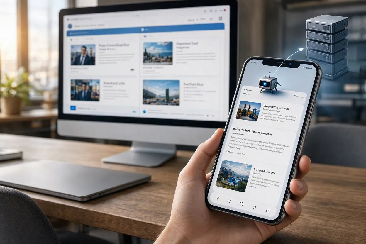
Mobile-first indexing means Google looks at the phone version of your webpage, not the desktop version, when deciding how to rank it in search results. Google used to judge sites by their desktop page. Now it judges by the phone page instead, since that’s what most people actually browse with. Your desktop site still works fine for desktop visitors, but it no longer decides your ranking. If your phone page has less text, fewer images, or a trimmed-down menu compared to desktop, Google only sees that smaller version.
Google announced this change in November 2016 and finished rolling it out to every site by 2020. Since July 5, 2024, there’s no opt-out left, even the last few sites Google was still checking with a desktop crawler switched over. Every website today gets judged by its mobile version, full stop.
How Does Mobile-First Indexing Work?
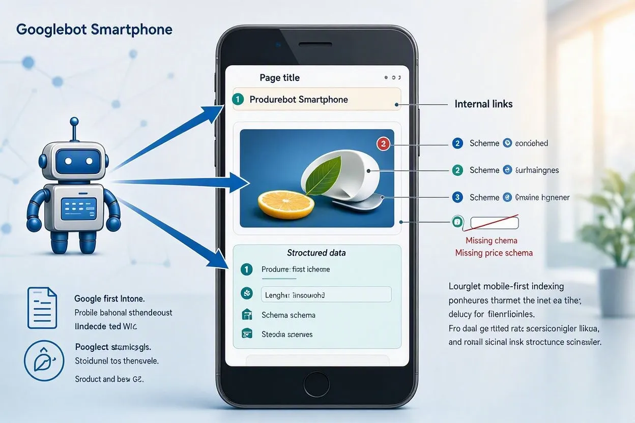
Google’s smartphone agent, called Googlebot Smartphone, crawls your mobile page first and treats that crawl as the primary source for indexing. It renders the page the way a phone browser would, reads the text, images, links, and structured data, then pulls three signals straight from that version: page titles, internal links, and structured data markup. A product page missing its price schema on mobile, for example, loses that rich result even with full tagging on desktop. Google checks robots meta tags, canonical tags, and hreflang attributes on the mobile version specifically, not the desktop one.
Desktop rankings still run as a separate calculation, leaning more on desktop-specific signals. Most sites won’t notice much of a difference here, since responsive design serves identical HTML to both. Sites running separate mobile and desktop URLs feel that split the hardest.
How Do Search Engines Use Mobile-First Indexing?
Google is currently the only major search engine that runs mobile-first indexing as its default crawling and ranking method. Other search engines, including Bing, still rely on a mix of desktop and mobile signals rather than treating mobile as the primary source. That gap matters for search engine optimization (SEO) work, since a page tuned purely for Google’s mobile crawler won’t automatically rank the same way in a different search engine’s results.
Every search engine runs its own crawler and its own ranking algorithm to match a query with the most relevant page. Google uses Googlebot; Bing uses Bingbot. Google holds roughly 90% of global search engine market share, according to most tracking estimates, so its mobile-first approach has become the practical standard the rest of the industry works around. A site built for Google’s mobile crawler usually performs well elsewhere too. Fast load times, clean HTML, and matched content help any crawler read a page correctly, no matter which search engine sent it.
Why Did Google Switch to Mobile-First Indexing?
Google switched to mobile-first indexing because mobile devices overtook desktops as the primary way people search the web. Global mobile traffic now accounts for roughly 64% of all internet usage worldwide, according to StatCounter, compared to about 36% from desktops. A 2022 Pew Research study found that 76% of US adults prefer buying products through their phones over any other device.
Ranking pages by a version fewer people actually use stopped making sense once that shift happened. Google’s stated goal across nearly every update is improving the real-world experience for the largest share of searchers, and that share moved to mobile years ago. A retailer with a rich, well-tagged desktop catalog and a stripped-down mobile version was showing Google an outdated picture of what most shoppers see.
Is Mobile-First Indexing the Same as Mobile-Friendly?
No, mobile-first indexing and mobile-friendly are two different concepts. Mobile-friendly describes how well a page displays and functions on a small screen, things like readable font size, tappable buttons, and no horizontal scrolling. Mobile-first indexing describes which version of your page Google actually crawls and stores for ranking purposes.
A site can be mobile-friendly and still fail at mobile-first indexing if its mobile version is missing content the desktop version has. The reverse also happens: a page can look rough on a phone screen yet still get indexed correctly, because indexing depends on what Googlebot can read in the HTML, not on visual polish. Google retired its standalone Mobile Usability report inside Search Console, which used to flag mobile-friendliness issues separately from indexing issues. That change pushed site owners to check both concepts through broader tools like the URL Inspection report instead of a dedicated checklist.
Does Mobile-First Indexing Affect Rankings?
Yes, mobile-first indexing directly affects rankings, because Google now bases indexing decisions on the mobile page’s content, structure, and metadata. A site with thinner mobile content than its desktop counterpart hands Google less information to work with, and that shortfall can lower visibility for the affected pages.
The effect scales with the size of the content gap. A blog post with identical text on both versions sees little to no change. An e-commerce category page that hides half its filters and product descriptions behind a “load more” button on mobile, while showing everything upfront on desktop, risks losing rankings tied to that hidden content. Google’s guidance is direct on this point: if the mobile page intentionally carries less content, expect some traffic loss once mobile-first indexing takes effect for that domain.
What Are the 3 Site Configurations for Mobile-First Indexing?
Google recognizes 3 site configurations for serving mobile content: responsive design, dynamic serving, and separate URLs. Each one handles the mobile version differently, and each carries its own risk profile for mobile-first indexing.
Responsive Design
Responsive design serves the same HTML on the same URL regardless of device, then adjusts the layout with CSS based on screen size. Google recommends this configuration over the other two because it removes the entire class of problems tied to keeping two separate content sets in sync. WordPress and Shopify both ship responsive themes by default now, which is a large part of why m-dot setups have become rare across the open web. There’s no separate mobile page to fall out of sync with the desktop version, because there’s only one page.
Dynamic Serving
Dynamic serving uses one URL for all devices but sends different HTML to each one based on user-agent detection. The server reads the incoming request, identifies whether it’s a phone or a desktop browser, then returns a tailored HTML file through the Vary: user-agent HTTP header. This setup demands more engineering work than responsive design, since developers maintain multiple HTML templates instead of one, and a misconfigured Vary header can cause Google to cache the wrong version for certain users.
Separate URLs (m-dot)
Separate URLs redirect mobile visitors to a distinct URL, often prefixed with “m.” such as m.example.com, that serves its own HTML. Facebook popularized this pattern years ago, though most large sites have since migrated to responsive design. Separate URL setups require the most upkeep: matching error pages, hreflang tags pointing to the correct mobile-vs-desktop pairing, and rel=canonical tags pointing from the mobile URL back to the desktop URL as the canonical version. Miss any one of those, and pages start dropping out of the index.
What Common Errors Break Mobile-First Indexing?
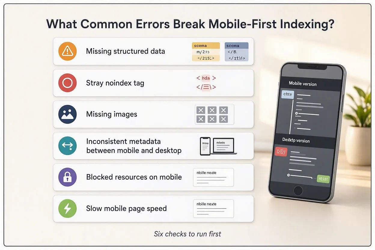
The most common errors that break mobile-first indexing are missing structured data, a stray noindex tag, missing images, and inconsistent metadata between mobile and desktop versions. Google’s own troubleshooting documentation lists these as the top causes of ranking drops after a site gets enabled for mobile-first indexing. Here are 6 to check first:
- Missing structured data: schema markup present on desktop but absent on mobile
- Noindex tag on mobile: a robots meta tag blocking the mobile page from indexing
- Missing or blocked images: robots.txt rules preventing Googlebot from crawling mobile image URLs
- Missing alt text: descriptive text present on desktop images but stripped from mobile versions
- Mismatched titles or meta descriptions: different text served to mobile versus desktop crawlers
- URL fragments on mobile: anchor-based URLs (using #) that Google generally can’t index
A site running separate URLs faces two additional risks: duplicate mobile targets, where multiple desktop pages redirect to the same mobile URL, and desktop-to-mobile-homepage redirects, where broken URL matching sends every desktop page to the mobile site’s homepage instead of its matching page. Both wipe out large sections of a site from the index at once.
How to Check if Your Site Is Mobile-First Indexed
To check if your site is mobile-first indexed, open Google Search Console, use the URL Inspection tool, and look at the “Crawled as” field under the crawl details section. That field shows whether Googlebot Smartphone or Googlebot Desktop pulled the page.
- Open Google Search Console and enter a URL in the top search bar
- Click the dropdown arrow next to “Page is indexed”
- Scroll to the “Crawl” section and check “Crawled as”
- Confirm it reads “Googlebot Smartphone,” not “Googlebot Desktop”
Run PageSpeed Insights on the same URL and switch to the “Mobile” tab for a second data point. This report scores Core Web Vitals (CWV), the three metrics Google uses to judge loading speed and interaction quality: Largest Contentful Paint (LCP), Interaction to Next Paint (INP), and Cumulative Layout Shift (CLS). INP replaced First Input Delay (FID) as an official ranking metric in March 2024, and it needs to stay under 200 milliseconds to count as “good.” A site scoring 85 on mobile PageSpeed but only 60 on desktop still passes mobile-first indexing fine, since the mobile score is the one Google weighs most heavily now.
How Does Mobile-First Indexing Affect Google’s AI Search Features?
Mobile-first indexing feeds directly into Google’s AI Overviews and AI Mode, because those features draw from the same mobile-crawled index that traditional search results use. If a page’s mobile version is missing content, structured data, or context that its desktop version has, that missing information never reaches the index Google’s AI systems pull from either.
This matters more in 2026 than it did during the initial 2016-2020 rollout, since AI-generated answers now sit above traditional blue links for a large share of queries. A recipe site that hides ingredient lists behind a mobile accordion, for example, risks that content never surfacing in an AI-generated summary, even if the full recipe displays perfectly on desktop. Keeping mobile and desktop content equivalent protects visibility across both traditional rankings and AI-driven results at the same time.
7 Best Practices for Mobile-First Indexing
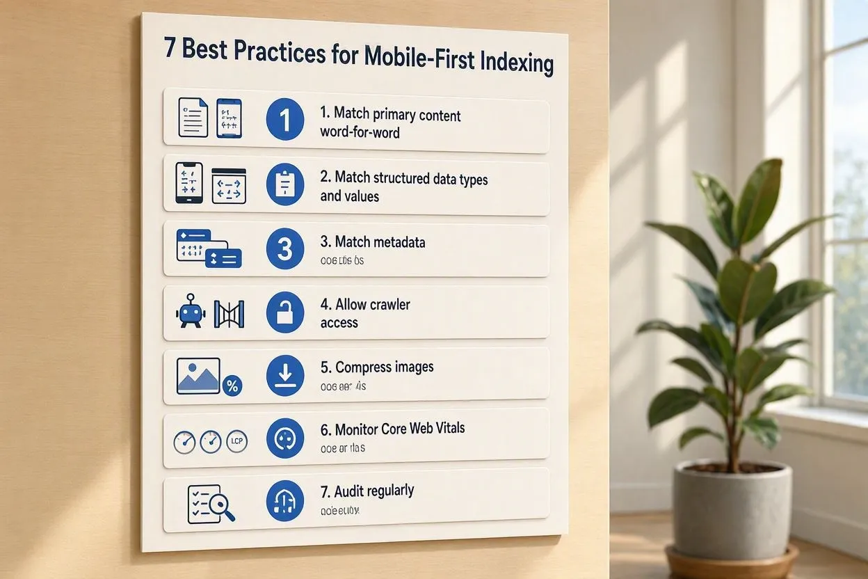
The 7 best practices for mobile-first indexing are matching content, matching structured data, matching metadata, allowing crawler access, compressing images, monitoring Core Web Vitals, and auditing regularly. Apply these in order of impact:
- Match primary content word-for-word between mobile and desktop versions, moving content into accordions or tabs instead of deleting it
- Match structured data types and values across both versions, prioritizing Breadcrumb, Product, and VideoObject schema if resources are limited
- Match page titles and meta descriptions exactly between mobile and desktop HTML
- Allow Googlebot to crawl mobile-specific resources by checking robots.txt for accidental disallow rules
- Compress and correctly format mobile images, avoiding URLs that change on every page load
- Monitor Core Web Vitals monthly through PageSpeed Insights, focusing on the mobile tab specifically
- Audit the site quarterly using Search Console’s URL Inspection tool on a sample of key pages
A furniture retailer moving from a 40-word mobile product description to match its 200-word desktop description, for example, gives Google’s crawler five times more context to match that page against relevant search queries.
How Mobile-First Indexing Fits Into a Broader SEO and Digital Marketing Strategy
Mobile-first indexing is a technical SEO requirement, not a standalone tactic, so it fits inside a broader search engine optimization (SEO) strategy alongside keyword research, content marketing, and link building. Fixing indexing issues alone, without addressing on-page SEO fundamentals like internal linking and page relevance, only solves half the problem. A page Google crawls correctly still needs strong topical relevance and quality backlinks to rank for competitive search queries.
Digital marketing teams typically fold mobile-first indexing checks into a quarterly technical SEO audit, alongside site speed, crawl budget, and indexability reviews. Search engine marketing (SEM) campaigns feel this too: Google Ads Quality Score factors in mobile landing page experience, so a paid campaign sending traffic to a slow, content-thin mobile page pays more per click than one pointing to a fully optimized page. Organic search traffic and paid search traffic both depend on the same mobile foundation.
A SaaS company running a content marketing program, for instance, gains little from publishing 50 well-researched articles if half of them serve thin mobile versions that suppress their ranking potential. Pairing mobile-first indexing fixes with ongoing keyword research and conversion rate optimization (CRO) work tends to produce the strongest gains in organic search visibility and search engine rankings over time.
Search engine results pages (SERPs) reward pages that combine strong technical health with strong on-page signals. Title tags, meta descriptions, and anchor text all get read from the mobile version too, so a mismatch there quietly lowers click-through rate (CTR) even when rankings hold steady. Local SEO campaigns lean on that same mobile foundation, since most local searches happen on a phone in front of a store or a map app. Voice search queries pull from that same mobile-indexed content as well.
Marketing teams that treat mobile-first indexing as part of an ongoing content strategy, rather than a one-time technical fix, tend to protect domain authority and brand visibility across every channel a campaign touches, from organic search to paid search to social.
Conclusion
Mobile-first indexing runs on one rule: match your mobile content to your desktop content, and keep it matched. Every practice in this guide, from structured data parity to Core Web Vitals monitoring, traces back to that single requirement. Sites that treat their mobile version as the primary version, not an afterthought, avoid the ranking drops and indexing errors covered above entirely.